 You don’t NEED a fantasy map. There’s a lot of things you don’t need in life: drugs, alcohol, rock n’ roll, wild raves that end in the hospital. But life would be that bit more boring without them. Besides, if you create an entirely new world from your dark and strange parts, then sometimes it’s a handy little addition to help dear Mr. Reader visualize your world.
Besides, if you create an entirely new world from your dark and strange parts, then sometimes a map is a handy little addition to help dear Mr. Reader visualize your world.
This isn’t a definitive guide, and I’m not the fantasy map police. But I did learn some killer lessons while having my fantasy map created. You know me, I’m all for sharing the love and fluff and lessons.
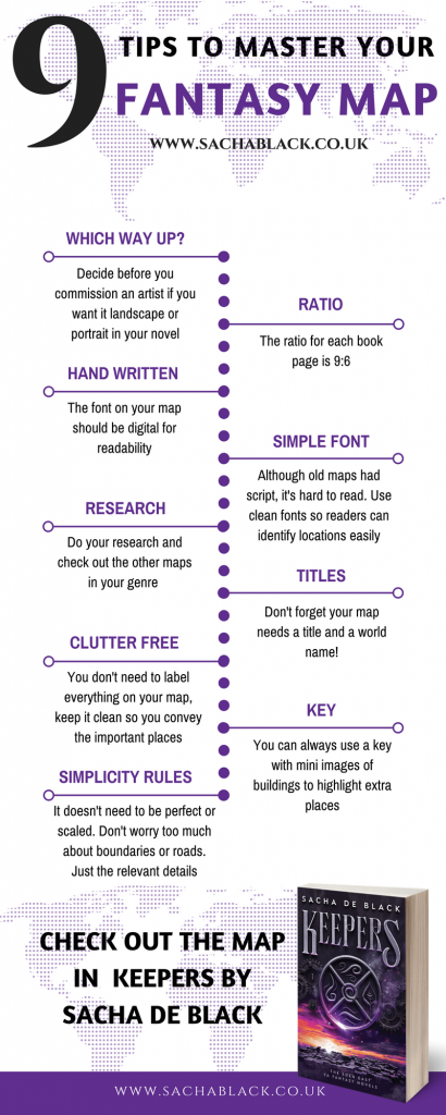
Here are 9 quick tips to master your fantasy map.

ONE – UPSIDE, RIGHT SIDE, DOWN
Before you start commissioning an artist, make sure you’ve decided which way round you want the map in your book. Don’t, like me, assume the artist will ‘know’ you want it to be landscape and across two pages.
If you do want it landscape and across two pages, make sure you know how you’re going to format that puppy… because it’s guna be a bitch to change portrait to landscape. A one-page map is FAR easier.
TWO – RATIO IS EVERYTHING
Alongside knowing which way round you want the map in your book, you also need to take into account the ratio of the pages. An A4 page, for example, is not the same ratio as a book page. Thanks to Axil Hammer Book & Logo Design for that top tip.
Oh, and the ratio you want is… 9:6
THREE – WORDS SCHMERDS
If you’re having your map illustrated, like I did, make sure you tell the artist not to put any labels on the map. Digital font is uniform, it’s always better to have uniform font for ease and readability.
FOUR – SIMPLE IS BEST
Which brings me on to point four. While old Latin style fonts might be ‘in’ keeping with maps, don’t be a dufus and make them illegible. You want your reader to be able to easily discern the locations and labels. Sometimes the simpler the font, the better.
FIVE – KNOWLEDGE IS POWER
There are definitely styles of map out there – make sure you’ve researched your genre and have some examples to show your illustrator.
SIX – TITANIC TITLES
Don’t forget the title of the map – kinda key – you need the reader to know the name of the world you created… I definitely didn’t forget that… honest.
SEVEN & EIGHT- THE KEY TO EVERYTHING IS SIMPLICITY
If you have beautiful illustrations then you might not want to ruin the map with lots of labels. You need a balance between depicting the complicated world you’ve built and labelling absolutely every street, house, and public toilet.
In most cases, you’ll have a country-sized map. I’ve seen some street-level maps, but those are rarer.
You can get around this balancing act by including a key with miniature versions of the buildings you don’t have space to label.
NINE – SIMPLE FOR THE THIRD TIME!
If I haven’t said it enough, here’s a third time. Keep it simple. If you use state lines or area boundaries, consider whether you really then need main roads or streets. Likewise, don’t get your knickers all knotted over making it perfectly scaled if one building is too big and another too small, no one will notice.
The point is, don’t overfill your map. Only put important locations on that are referenced in your story.
***
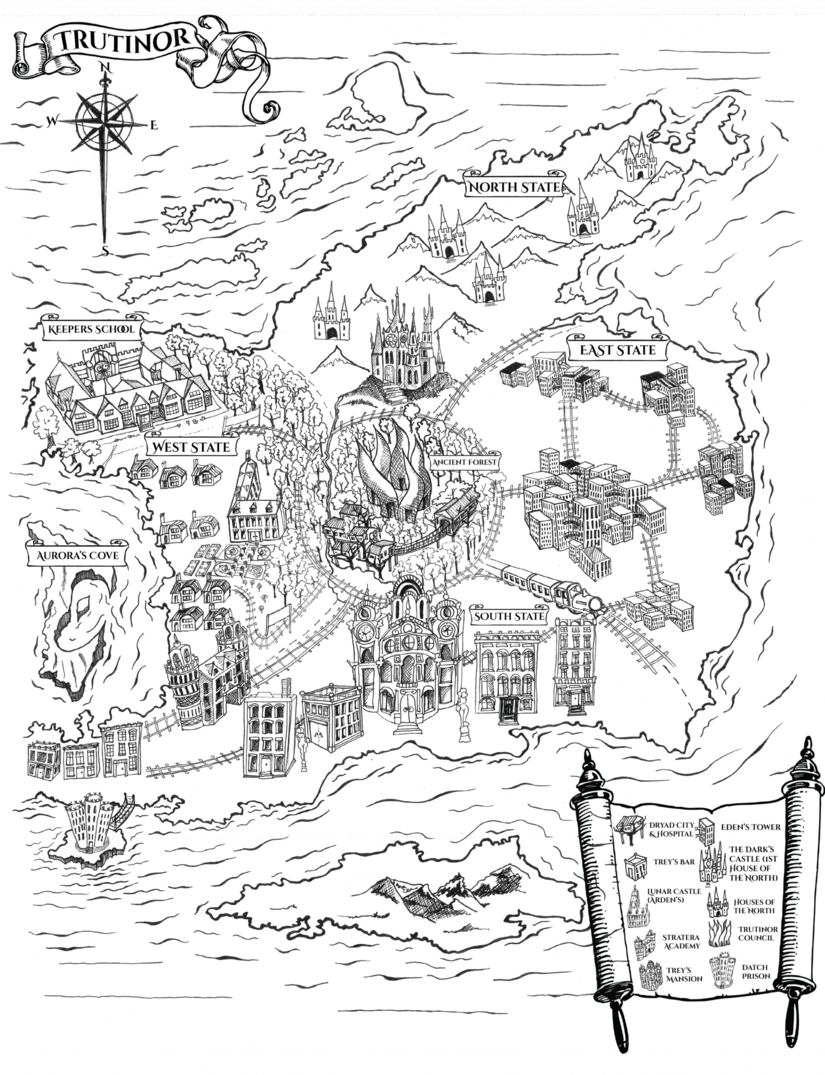
So here is my map of Trutinor, designed and illustrated by my disgustingly talented and wonderful mama. You should be able to click the image to see a larger version.

 Read Keepers now. Or to hear more about the release of the sequels as well as get regular CogMail updates you can do so here.
You can also find me on Facebook, Twitter, Instagram, Pinterest, Goodreads
Excellent points and a lovely map, Sacha. I’m looking forward to reading!
Thanks so much for sharing 🙂