 I’m not shallow…But I definitely judge a book by its cover.
Shit. That makes me shallow doesn’t it?
Ah well, fuck it. At least I can admit it.
I’ve been thinking about marketing a LOT recently. Minus a total meltdown last week and a decision to bin (and subsequently re-write the last 30K of my book), I am still on track to send my book-baby to beta readers on 30th September.
Being the incessant 5 steps-a-head planner that I am, it means my mind is on marketing, book covers and that big ol’ scare-the-shitsicles-out-of-you decision: Do I run the poison, trap-infested gauntlet to a publishers door? Or drown in the overly saturated ‘Amazon’ rainforest of books as an indie? As it happens, I’ve finally made my mind up, but I’ll leave that for another post.
Book covers are without doubt, THE most important marketing decision you’ll make. Fuck it up, and you can watch your readers Foxtrot Oscar into the sunset, never to return to your bookshelf! So, I’m sharing my research and the lessons I’ve learnt in preparing to have my book cover designed.
Thing One – Genre
Know your genre. I know. Sounds like I took my stupid pull this morning cause of course you know. But seriously, think about it. You go into a bookstore and you can identify ‘your’ spot, you know the exact location your fave books will be in, just by looking at the shelves. No one read the signs anymore, we just look at the covers!
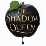
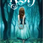
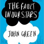
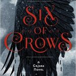
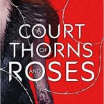
Scroll through – there are lots of covers in the gallery.
Those are some of the currently popular covers from the YA genre. You can tell a lot when you line a row of books up. I can often be found, detective specs on, snooping in a Waterstones (or #GoogleTranslate: Barnes and Noble). I actually have an album on my phone dedicated to book covers. I snoop. Take Photo. Repeat. I collect them in order to deconstruct and analyse their make up.
Even from the small selection in the slide show, you can see there are clear themes to all these YA (generally fantasy) covers:
- Most have a clear theme or symbol from their stories represented centrally in the cover
- Bold colours. Lots of blues, whites and blacks.
- More often than not with yellow or white writing.
- The book title is larger than the author’s name
- The book titles are generally less than 3 or 4 words, and more often just one word
- There’s a variety of placements of the title words from the top to the centre and even to the lower quartile of the book so placement seems more about overall fit than a formulaic style
- Of the 18 books included, only 4 have an obvious image of a person on the cover. One other has very small figures in the distance. But for this genre it doesn’t seem essential to have a figure or body part on them. Unlike say, romance.
The point is, don’t make assumptions. Markets and genres release new books constantly. Which means the tropes and themes within those genres are always evolving. When you need a cover creating, stop and analyse the top 30 books in your genre to see what the themes are.
Thing Two – Same, Same but Different
Why examine book covers in your genre when you want your cover to be different? Well, let’s pretend we’re bitchy school girls. To get in with the cool crowd you need to be the same as them but unique enough you’re valuable the Queen Bee.
If your book is on a shelf in Waterstones, you want it to be identifiable within your genre. But you also need to be different enough that it actually stands out to readers (in the milliseconds they glimpse your book).
Normally I’d tell you comparing is a plague, its second only to the plague of self-doubt. But when it comes to covers it is essential to collect and compare so you know what you’re up against, what tropes you need to follow and what you can happily avoid in order to stand out.
Simply – follow the key (reoccurring) patterns in your genre but in your own way.
Thing Three – Write Your Own DETAILED Brief
If you’re rolling your eyes, because you’re giving your cover to a designer therefore it’s not your problem, then stop rolling and listen up.
If you’re an indie author, the cover is down to you. If you’re going to pay out for a designer you might as well make sure you get what you want. The more detail you can give upfront the less iterations you will go through and the less it will cost you. Most designers have a limited number of changes they will make, which is why this is so important.
Give as much detail as you can, including:
- Target audience and genre
- Colour schemes
- Spellings (REALLY important)
- Examples of other covers you like AND importantly examples of ones you don’t like too
- If you have a preference on layout
- Any conceptual information, i.e. if you want a symbol or particular ‘image included, like a door or a key’
- Whether you want a person in the cover and if you do, whether you want it realistic or otherwise
- If you have a preference on style or type of typography /font
- Whether you want an eBook or print or both versions
- If you have a short synopsis why not send it with your brief
Thing Four – Colour Matters
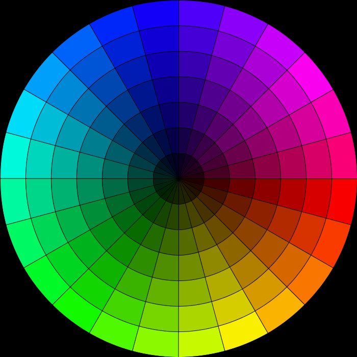
pastels and happy summer type colours.
Study your genre, but also ask yourself what fits your story? If it’s a dark story you need dark colours and vice a versa.
On font colour, keep it simple. Opposing colours to the ‘main’ book colour work well, and as you can see in the slide show, the YA books mostly have white or yellow font. Your designer will advise you, but it helps if you go in knowing what you want so you don’t change your mind two months after you launch it.
Thing Five – Fonts
I don’t profess to be an expert on fonts, and again your designer will help with this, but if there are fonts you like in your genre, show them to your designer. You need to decide if the font is the focal part of your cover or if the image/symbol is. This determines how fontalicious you can go with your typography.
BookCoverDesigner has a great post on fonts and what are well used fonts on covers.
Thing Six – What’s Your Symbol?
Your cover needs to symbolise something – your story, obvs!
Even if you don’t have a physical symbol on your cover, like a lot of the YA books do, you need to somehow symbolise your story in the cover. Perhaps using your books central theme.
How do you do this? The same way you write. Show don’t tell. The TED talk below is all about book design and the same reasoning goes for covers as it does writing.
Readers, much to our writerly surprise, aren’t idiots. I know. I know. It’s a hard pill to swallow. But really, they do interpret and infer, so you can be somewhat abstract when it comes to your cover. Especially if you have a nifty title giving the reader context.
Last But Not Least – Thing Seven – Details. Details. Details
While your designer is shimmying up a book cover, think about whether you need a thumbnail image, a spine and back cover for print books. Do you need additional marketing materials?
Such as:
- Business cards with book designs on them
- Bookmarks
- Postcards
- Physical posters and Banners
- eMaterials for Facebook or twitter or any other social media
- Merchandise with covers or symbols on them
The world is your oyster – but economies of scale apply. Once you have designs it doesn’t take much for your designer to add them to a little something-something else!
If you found this post useful, why not sign up for lots more handy tips and tricks, for FREE. Sign up here.










Great post, Sacha! thanks for the advice and the link to the fonts post too. KL <3
No problems, glad you liked it 🙂
Do make sure the cover reflects the story accurately. I read one book where the killer used a wooden handled knife. Yet the cover had a black Sabatier type knife. Not clever. It also had a London landmark that was mentioned once, ONCE, in the whole story, when the protagonist cycled past it.
Also ask your editor or beta readers or whoever for their views about whether the cover fits the story. I do cover advice included as part of the editing package, but I’ve also done it for other bloggers for free. Some authors do a poll with a choice of 3-5 covers.
If authors ask for individual comments, make sure to ask the sort of people who say ‘I like/don’t like this BECAUSE …’ not the people who say ‘yes it’s great to everything’. That pov is neither use nor ornament.
I agree – I think its essential that the story is reflected in the cover.
I think you make a really good point about whose opinion you take and which ones you don’t. For me, advice and views are great, but sometimes I just disagree and I have a very clear vision for my cover. But if you aren’t as clear, I think seeking advice is a great thing to do.
Great post, Sacha! What a fabulous selection of YA covers too – all my favourites 🙂
Hehe thanks Shelley 🙂 I haven’t read them ALL but a lot of them 🙂
Did u do an analysis before u had your cover designed?
I did. I followed the same path as you – in fact, I was the other shopper in dark glasses and the flasher mac lol. When I found Blue Harvest Creative, I studied their previous cover designs and loved what they had produced so I went with them. From a simple synopsis they created my beautiful covers – I was over the moon with them. 🙂
hahaha and what a fetching mac it was! :p
p.s. you do have an awesome cover – I love the guardians one.
Great advice… I’m gonna do that thing re keeping an album of covers in my genre, love that idea, seeing how forgetful I am! It took 25 emails before I got my first book cover, because I was so vague and unsure of what I wanted or needed. Fortunately, my cover designer was patient and knew a lot more than me. However, a year later I still changed it to the current one, although I still have a fondness for the original. One thing you didn’t really mention is how the cover art looks as a tiny thumbnail… this is really important because initially this is all the potential reader/ buyer will see. It has to grab their attention enough at this stage to make them click on it and see it in its full glory. So all the text has to still be clear and readable at this tiny size, the genre has to be obvious and it has to be eye-catching even if the detail of the image is not that clear. Therefore sharp clean and simple is the order of the day.
Also, the reason why we have the saying ‘don’t judge a book by the cover’… originally covers were made of boards covered with leather just to protect the pages and keep them flat. They didn’t even have titles on them. Hence they all looked the same. Gradually the leather was worked into designs and became decorative until we have what we have now. Btw you’re not alone… we all judge books by the cover now, because we can. They are a good indicator of a book these days. That saying has become outdated! Lol!
WOW 25?! lol, that really is A LOT of emails, you defo got yourself a patient designer.
Oh – I should have said a thumbnail – I thought I put that in there, but you’re right I probably didn’t highlight how important it is, because you are absolutely right.
How cool is that by the way – I had no idea that was the reason behind the saying. You learn something everyday! bloody love that nugget! 😀
Lol! You are funny! Btw you did mention thumbnails but not in the context I was talking about. And I mentioned it because I learned the hard way. I love my first image even now, but as a thumbnail it did not look good and irritated me immensely. Don’t want people to make the same mistake I did. ?
oh yeah I love learning so will have to come check thumbnails out with you before I sign them off 😀
Another informative post, just love em… I have been trying to find the post you did, on creating those lovely posters of yours as I’m having no joy on Canva, and can’t find it. What have you done with it?
ahh thank you so much 😀 you always make my day.
The post I think, is this one: https://sachablack.co.uk/2015/12/28/5-mind-boggling-reasons-canva-is-your-blogging-design-heaven/
tucked away cause it was a while ago! But defo still there! <3
didn’t you do a post about how you make your posters? I need to come up with a special poster to encourage everyone to nominate Anita’s new book on KindleScout…and my brain is blank!
So I did, here it is:
https://sachablack.co.uk/2015/09/21/4-easy-steps-to-seriously-awesome-blog-post-photos/
I’ll tweet it too if u like – let me know when the voting is up 🙂
it starts today… post coming up with the link! Thank you in advance!
Awesome, happy to help 😀 let me know and i’ll share 😀
post is live, and thank you, Sacha…
Right done. Keep prodding me and ill KEEPS sharing. ?
Bless you too, Sacha…
I would like to add another point, if I put my graphic design teacher hat on!
You really really need to do your research, as you’ve said, and see what else is going on. BUT it’s probably best NOT to go for a cover that looks like, say, Stephen King or Neil Gaiman (you haven’t advised this but I know some authors have on their blogs). Writers at that level can get away with more abstract covers that don’t fit genre conventions because their name sells the book. Until you’re at their level, stick to playing with a genre. That’s not to say you can’t be a bit more individual, but it at least needs to look familiar to a potential reader.
Cracking point. I agree. I think it’s important to stay ‘in genre’ or in keeping with your genre because otherwise you miss your target audience. It’s one thing doing it if your Stephen King, but we generally don;t have ready made audiences. He can do what he wants because he has a huge fan base already there to buy his book. Great point. 😀
This is all great advice and so true because I think we all judge books by their covers whether we mean to or not.
Thanks Rachel 🙂 and I know, we do but it still feels awful admitting it!
It does, I agree.
Great post, Sacha and really helpful.
Ahh thank you Mary 🙂
Very informative and came just at the right time for me, whilst I plan my cover. Thanks Sacha
Love a spot of good timing glad it helped 🙂
one of the things with a creative writing course is the lack of focus on all things not the writing; such as book covers. Wish we’d had half of this when we got to ‘other’ at the end.
Maybe I should create an ‘other’ course! Full of all the shit I research! ?
Reblogged this on Don Massenzio's Blog.
Thank you Don. I always appreciate the share.
My pleasure. Great post.
This post got me thinking – a lot. I’m working on a five book series and before I started writing, I was already designing the covers. I’ve written the first book and half of the second, and now I’m going to be making some changes to those covers while I’m revising book #1 for the third time. But what do I do when these books are a hybrid of several genres: time travel, paranormal, science fiction, fantasy, horror, environmental, romance, historical fiction, etc?
In Thing Three, what do you mean by target audience in the detailed brief?
And, being shallow, or making snap judgements on what you (we all) see, might be hard-wired into our DNA.
I read an interesting piece once from National Geographic or Smithsonian (don’t remember which one and it might have been Psychology Today) that to survive our ancestors going back millions of years had to make snap judgements to survive.
When the world didn’t have teaming masses crammed in overcrowded and polluted cities and they were hunter gatherers, what do you do when you run into a stranger or a group of strangers out there in the wild? Do you take time to get to know them and judge them on who they really are or do you make a snap judgement from a distance to help you decide to run or fight?
Come to think of it, in the often brutal and dangerous teeming city survival might depend on snap judgements too.
It’s funny, lots of people do that – I think covers are really motivational. They make the books seem more real and tangible. I guess if it were me and they were a hybrid of lots of genres, I would say to go with a theme or major storyline that will then either indicate the predominant genre, or it will give you something you can use to see what others with similar themes do for their book covers.
Ok in thing three where I say target audience. I just mean who is your books target audience? Who are you going to market it at? There’s no such thing as a book that EVERYONE will like, teenagers don’t like the same thing at 40 year olds who won’t necessarily like the same thing as 90 year olds. So Defining your target audience is really important before you publish – and giving that info to a designer will help them to tailor a book cover to your specific audience.
The article your referring to – I suspect they are talking about the fight or flight syndrome which uses both parts or the nervous system to determine whether to run to save your life, or fight and say kill food or ownership of territory or whatever.
Hmm, have you been snooping on my computer recently? I’ve been mocking up some potential covers as part of my first draft final stretch pep rally. Awesome TED talk as well.
oooh how have you mocked them up? When I tried to do one to help motivate me with villains I ended up demoralising myself because it was rubbish. 🙁
I mock up in canva first and then in photoshop if I want to take a design a step further as canva’s layering isn’t the best. Pretty pleased with a couple of them even if they are far from what would be on the final product
Will you share?
Considering it ?
Excellent points here Sach. May I add, although it’s a good idea to keep book titles short, take advantage of using a subtitle, which is longer, for the added value of extra keywords.
Also, when it’s time for me (like now) to start thinking about a cover, I spend many evenings searching photo sites for ideas of what I may like to represent my book. I download these in a lightbox to forward to my artist with a short synopsis of my book so she has a feel for what I’m looking for. This saves lots of time for her not to have to start from scratch, she already has a good idea of what I’m after. 🙂
Completely agree on non-fiction books.
Not sure I’ve seen a fiction book with a subtitle – unless a series name counts? I’ll have a series name, but I don’t know if that counts? I’m guna plump with not.
My non fiction though – 100% Although I am changing my mind on the name already! haha.
Great idea on searching for photos. I might have to do that too. 😀
You may change your title several times. I find I’m lucky the epiphanies I usually get while in the beginning of my books. I come up with several titles and then I search them on Amazon to make sure no other books have one of them. Then I alter accordingly, and I know I’ve got my title. And yes, a series name will count in keyword search. 🙂
That’s a well good point – searching the titles in Amazon first. Didn’t know the series name bit either so thanks for that – now who’s the wealth of information! :p <3
Together, you and I could be dangerous, lol. 🙂 xo
I know we would!
😉
Awesome list, Sacha. I always struggle with how much info to give the cover designer because I don’t want to stifle the creativity with my lame ideas. It’s a real balancing act. I tend to provide a one-paragraph synopsis, one or two key visuals details (dragons, for example), and then some extra details if the designer wants to use them (takes place in winter, mountainous setting, medieval time frame). The rest I leave to the designer’s imagination. Another thing to think about is that paperback blurbs are limited to about 150 words. That’s not much. The good news is most readers will search for books on-line and your on-line blurb/description for Amazon is 4,000 words. They should be related but they’re not the same thing. Finally, if for some reason your cover isn’t performing, you can change it (been there, done that) – not ideal, but it’s not life or death for your book either. 🙂 Great post.
I know what you mean about stifling the designer. I think that’s a valid point and I guess it depends how set you are on a particular design. For me personally, at least with my fiction book I know exactly what I want, I’m just not capable of doing it. So I’ll provide a really intense brief. For my non fic book I haven’t a clue, I’ll barely be able to provide anything other than a rough idea!
What a jolly good point too – I hadn’t thought about a word limit for blurbs, but you’re totally right. I’m actually going to write that in my lessons log so I don’t forget. Thank you 😀
For the longest time, I was putting my back cover blurb in the Amazon Description and nothing more. Another writer pointed out that Amazon gives us the leeway to do a lot more with that space. Now I’m more creative there and it’s helped!
well I have actually added this to my lessons log – a kind of notebook with useful lessons I learn about marketing. I never would have thought of it either! so thank you 😀
Thanks so much for reading it 😀 glad you liked it.
Just so you know, I nearly cried reading this comment! What an amazingly lovely thing to say. Honestly, I really do try hard too, so thank you for noticing. <3 <3
This post is truly appreciated. I consider myself rather Soviet–five year plans, not gulags–in my writing endeavors. If I can’t land the agent/deal on my 15-year-old-codeine-addicted thief in another year I’ll take the self-publishing leap. However, I refuse to do it with some crayon-drawing/stock art cover. I need something mad, bad, and dangerous to know. Maybe with kitties. Don’t judge. Thanks again for the insight, Sis.
100% agree on the non crayon cover. haha love your description – made bad and dangerous! I can’t wait to see the cover.
SO many lols if you put kitties on it! ;p
Reblogged this on Silver Threading ~ Fairy Whisperer ~ and commented:
What excellent information! Thanks, Sacha! ❤️
Thanks Colleen – hope those storms have eased
For now they have, thanks, Sacha! ❤️
Excellent post, dear Sacha… there are many factors to keep in mind when choosing a cover… After reading your post I would say that asserting that you should not judge a book by its cover, is definitely a brutal, treacherous understatement…
How cool that you share that video by Chip Kidd… I had already watched it … he is so witty… the hermeneutics behind each choice is epic… I was particularly mesmerized by the story and ideas around Murakami´s `1Q84´… brilliant.
Best wishes, S… have a great week. Aquileana ?
Thank you Aquileana, haha you made me laugh. It is brutal and judgemental but I think its just the way of the world so we have to accept it.
Glad you like the chip video – I LOVED it.
Have a lovely week
Reblogged this on firefly465 and commented:
Brilliant advice don`t miss it. sachablack.co.uk
thanks my lovely
Brilliant advice Sacha have bookmarked this post in my library. 🙂
Aww thank you Adele glad you like it 🙂
Excellent advice, Sacha (as always). You mentioned getting fonts right. I would just add that, if it’s a cover for your first book, it’s a good idea to make sure the font for your title (but particularly your name) will work on future books. It’s all part of the branding
Cracking point that Graeme. Yep – I am writing a series so I will have to bare that in mind. Actually, I might just get the second cover designed while I’m at it. Or maybe I’ll just mock one up… just incase I completely change the plot! It’s been known! lol
Thanks very much, Sacha. I must admit to not being a fan of seeing the same images and symbology appear time and again… But I guess we’re creatures of habit. Great work!
I know what you mean about it being samey – I guess that’s the trick though – we have to find a way to be different but within our tropes.
Thanks for this!
No problems 😀
Thank you, thank you, thank you. I’ve been thinking about book covers and was going with my instincts while also researching how to design a killer book cover. This answered all my questions. So thank you. ?
Ahh you are so welcome 😀 glad you found it useful, good luck with your designing 😀
A really useful post that has come just at the right time for me, thank you so much.
However, a question for me is what to do for a cover of a book of short stories that covers many Genres? I do have an idea in mind for the book, so maybe I should just go for that. However, there are many elements in this post which I would have never thought about, so thank you, again.
Research! Go look on Amazon and see what others have done. Or take your fave story and use that as the cover. Or work out if there’s a theme running through them all – aren’t yours all dark?
No, there’s a mixture. Sci-fi, horror, comedy, drama, fantasy, LGBT, etc. but you’ve given some good points. I want something very unique which nobody else has thought of and that will make readers go – WOW! But, I suppose that’s what we all want. I’m the same with labels on bottles of wine. If I like it, then I’ll usually pick it and up and buy it.
Well i am glad I gave you some ideas 😀 I cannot wait to see both your book and your cover 😀
Hopefully, it will all be ready by the end of Sept for the launch on Dec 10th. It’s currently wth Esther who is editing and proofreading for me. ? So excited. Never thought I’d be doing this.
wow you’re on fire – so are you back to blogging now while its in edits?
No, I’m taking the time to write some new short stories for some competitions. I’m not sure, at this stage, when I’ll be back to Blogging. Once I get everything back from Esther there will be more work to do. I want to give it my full intention and taking a break from Blogging is certainly helping me with that.
Ahh cool I knew u were breaking but wasn’t sure if it would be an on off break in between book work 🙂
Fab post and agree 100%. I’ve been thinking a lot about covers lately. And bugging someone… *taps chine* Who was that? Anyway, yes. Great points. (And I can delete that Thought Bubble on covers now that I’ve caught up with your blog.) 😉
Chine? Hmm. *taps chine* Should I leave it and pretend I know something you don’t know? Maybe it’s a US slang word? No. Please. Chin. *taps chin*
haha
haha, you post it just the same Brentyn – your post will be different to mine and now I want to read it
Mine is just a ramble, as always. This is brilliant. Bookmarking. ?
I highly doubt that.
Great solid advice, Sacha. I just love the idea of your playing detective in the books shops with your camera at the ready! Seriously a brilliant idea.
hehehe I totally do too!! I’m unscrupulous about it! :p
Great post Sacha, lots of food and font for thought! Will come in handy. Thanks for all your awesome tips. 🙂
Thank you for reading Marje 😀 😀
Will bookmark this and send it to my artist/designer husband too. Thank you, Sacha!
Ahh I am sure he knows much more than me if he is a designer! 😀 <3 but thank you nonetheless 😀 😀 😀
Great breakdown and analysis, Sacha. I agree with all the points. My problem is that I’m not as creative as a professional cover designer. My favorite cover of all my books is the one that is nothing at all what I expected (The Bone Wall). So, as I work with a designer, what’s most important to me is 1) that they specialize in my genre and 2) I like their portfolio across the board. Then I give them free rein. I’m trying a new cover designer for the next series. Fingers crossed!
Interesting. See I had no clue what I wanted for my non-fiction. But Keepers – now that, I had an extremely clear vision of. Ish – I still gave a lot of freedom to the designer, but I tracked down, literally internet stalked the guy (because he’d done other covers I liked) and then demanded he work with me! :p – okay fine. I asked politely. I’m just glad he said yes, albeit with a larger price tag than I like to think about :p
That’s basically what I did with the next designer I’ve hired – internet stalked him! It’s a great way to get a feel for someone’s work 🙂
hahaha love a bit of internet stalking, we are not weird or scary in any way! pahahah
Hi Sacha! I enjoyed the post and learned a lot from it as well. This post could not come at a better time since I’m in the process of trying to figure out what the book cover for the 1st installment of my Fantasy Angels Series should look like. 🙂
I am so pleased to hear it 😀 glad you learnt something and that it was well timed. I just had my first draft covers back -it’s super exciting so I hope you get the same excitement as I did.